Problem Statment
Our PDPs have a high bounce rate of 80% within 2 seconds. 70% of users come to us via search engine.
Goals
Decrease abandonment rate
Increase time on site
Increase conversion rate
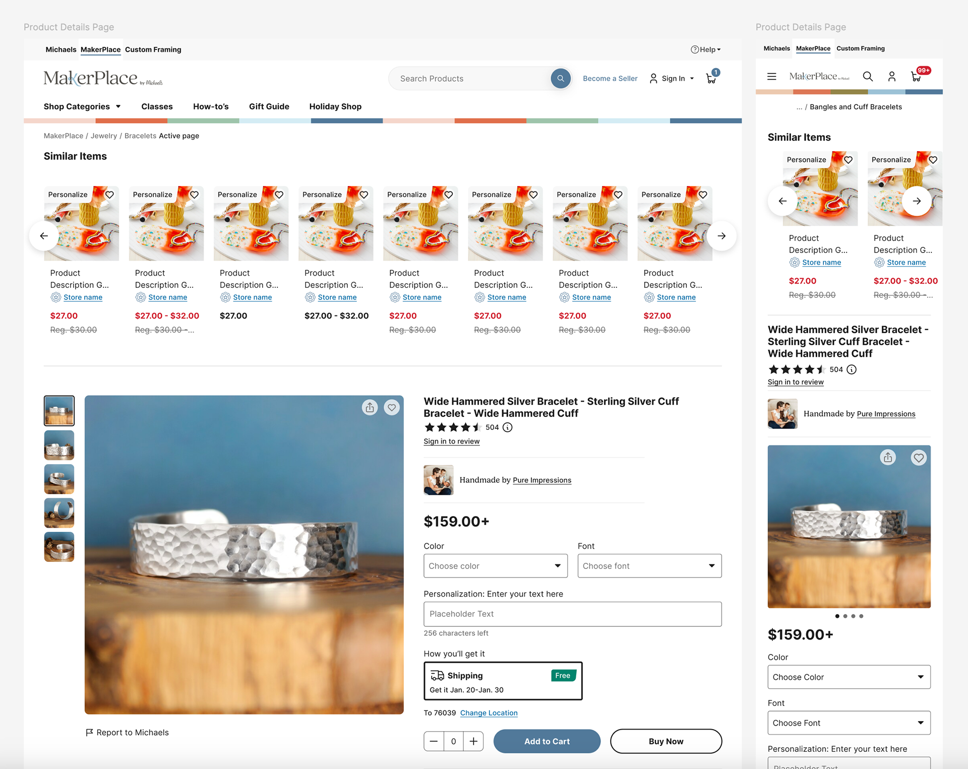
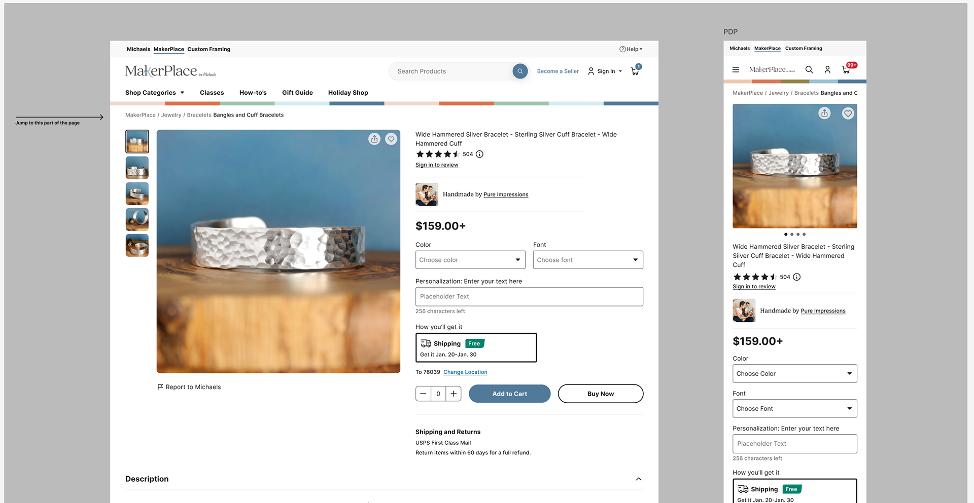
Our current PDP
The MakerPlace PDP has all the makings of a PDP, however through our discovery and research, we learned things could be better organized, have better type hierarchy and interactions.
Step 1
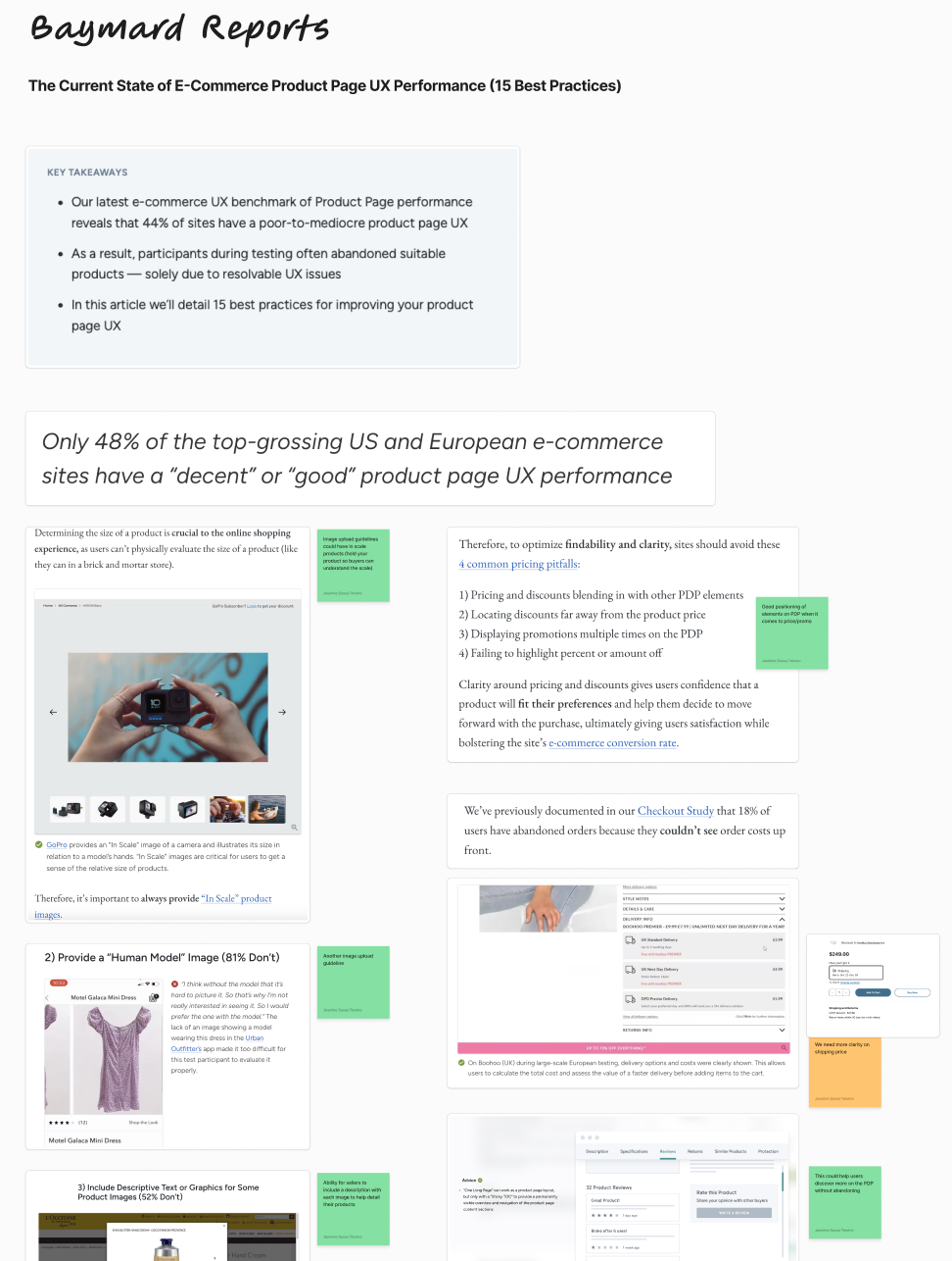
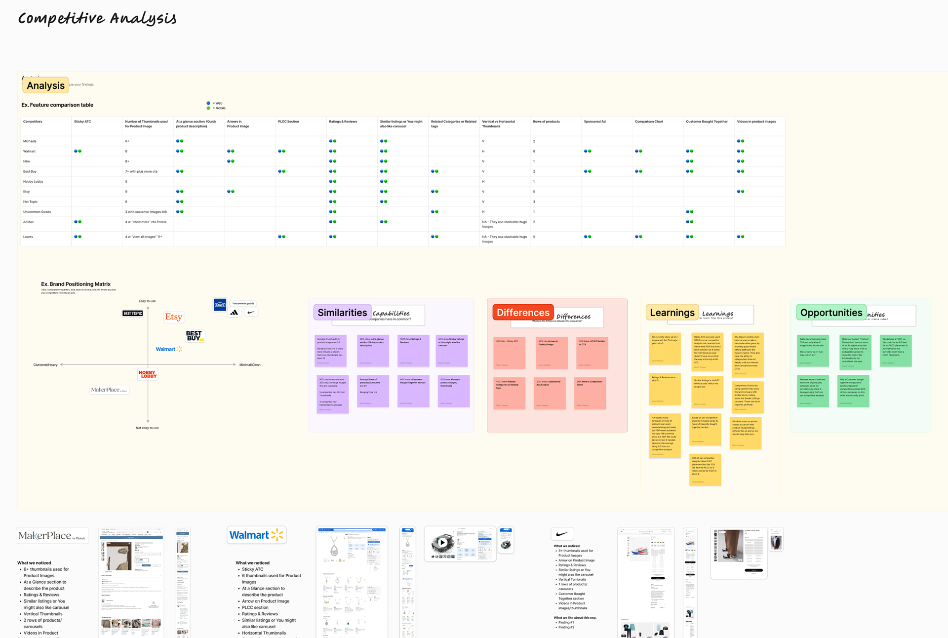
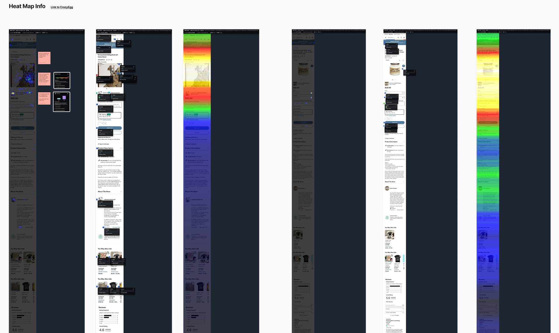
Discovery: competitor analysis, research Baymard reports, heat maps, and click rates.
User Research: interview shoppers who tend to look for gifts for others or themselves, personalized items, or Etsy shoppers.


Recommendation 1
Remove the carousels above the image and description
After testing our users, 90% were confused or turned off when they didn't see the product they clicked on right away. The carousel also didn't use user logic when displaying recommendations, so it felt out of place and not personal to their shopping habits.
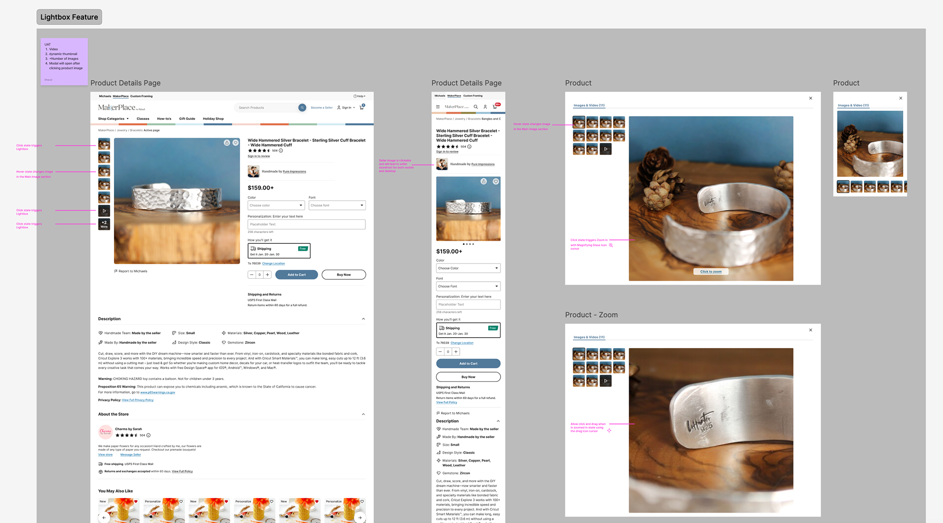
Recommendation 2
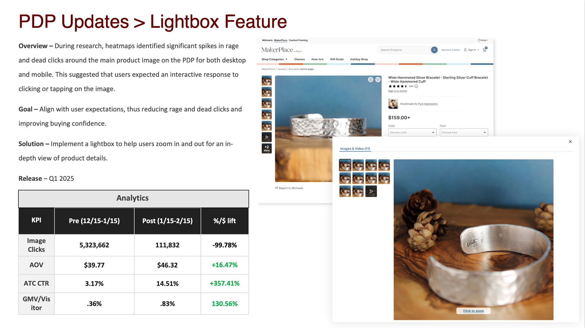
Seller image clickable and interactive light box modal for viewing more photos on PDP
When viewing our heat map and clicks, we noticed 2 major frustrations within the experience.
1. Nearly 700 dead clicks (clicking on a non-interactive element) on the image of a seller
2. 300 rage clicks (repetitive clicking) on the main image
These key points led us to believe that there were interactions not performing the way users would expect them to.
Recommendation 3
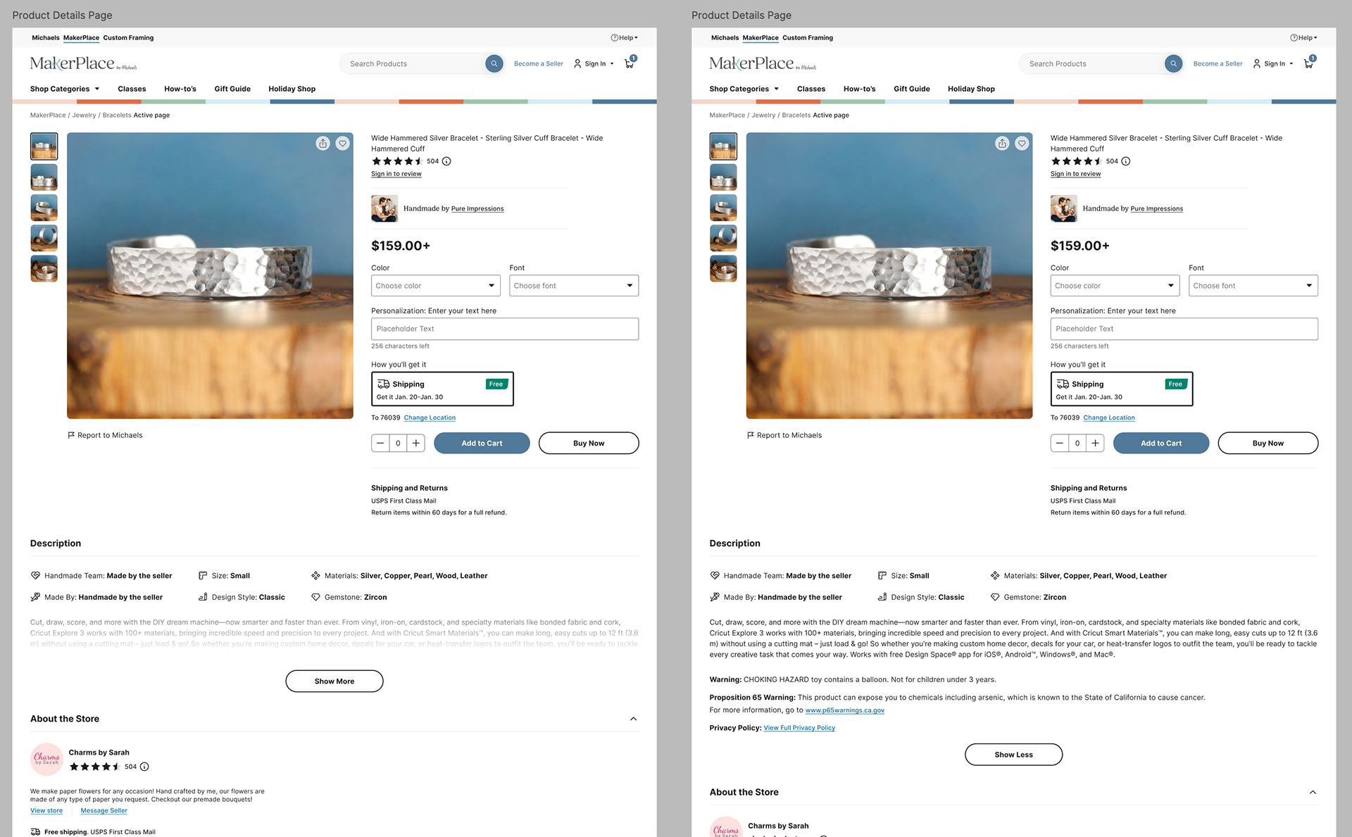
Reducing Cognitive Overload
When reviewing user interviews and Baymard articles, there were two recommendations we learned that could help the look and feel of the page.
1. Our shoppers rarely read the title of the page and it was our largest element
2. Depending on how the sellers wrote their descriptions, it could take up to an additional 3-4 scrolls to get down to the ratings.
These key findings led us to believe that we needed to rethink our description area and reduce our title size.
Testing & Results